
The Consequences of Defying Gravity: Case Study
The Consequences of Defying Gravity: Case Study
Media
ArtStudio Pro, Adobe Illustrator
Target Audience
Science-interested general audience
Client
Jodie Jenkinson
Context
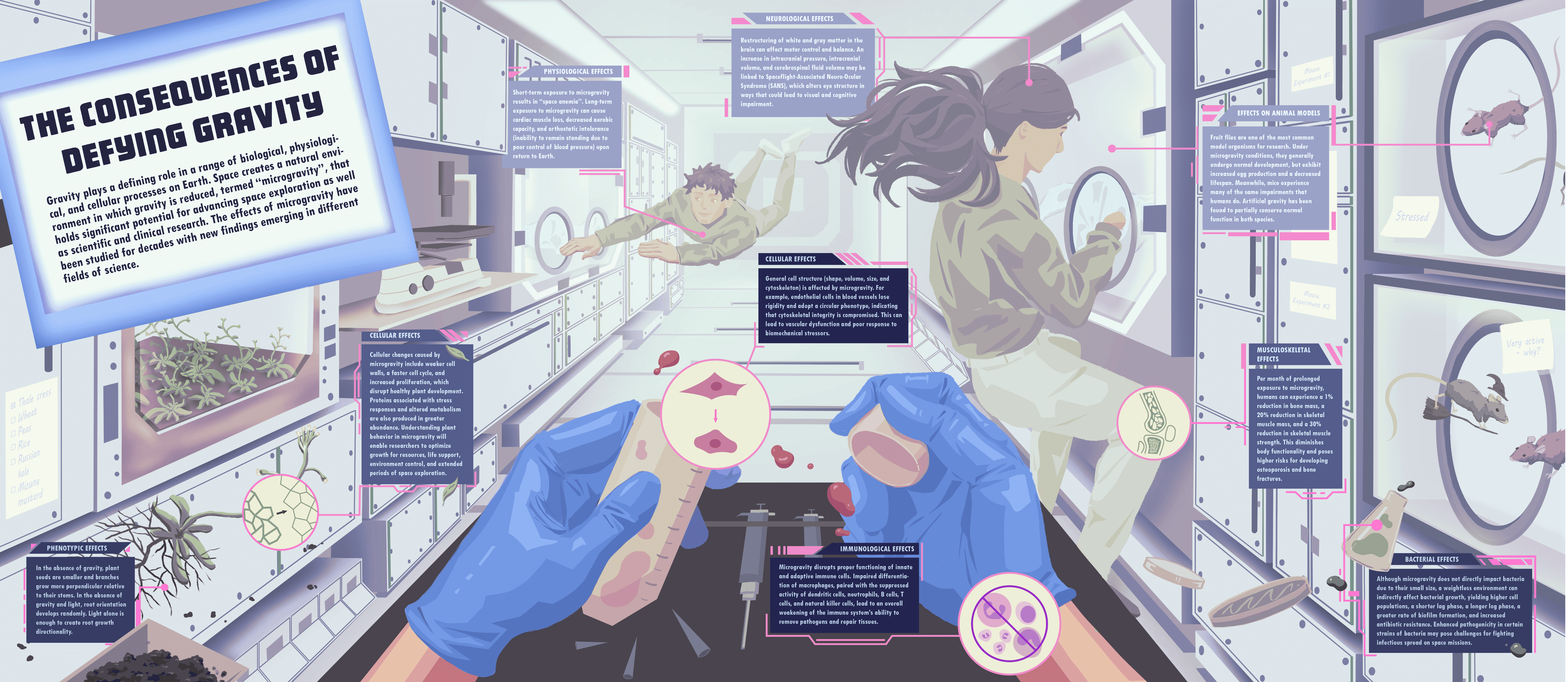
For this infographic, I wanted to visualize the different biological, cellular, and physiological responses to microgravity. The purpose of this visualization was to educate the audience on how space affects living organisms on Earth. Fun fact: this project was finalized around the time that both Project Hail Mary was released and the Artemis II launch occurred, which was a lucky coincidence!
Process
I created two conceptual thumbnails for this topic, shown below:
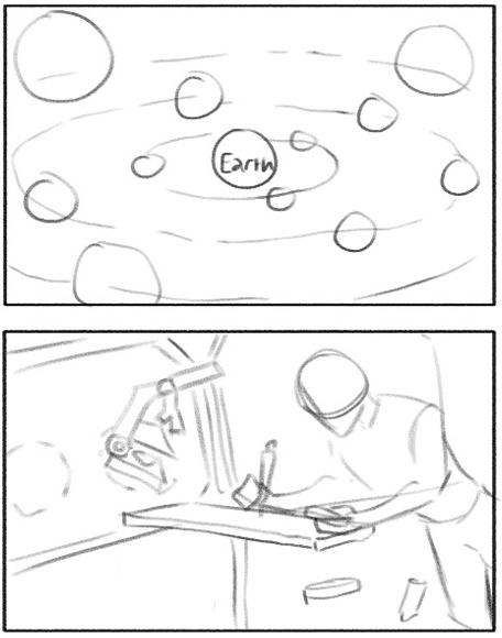
The top one depicted a scene in space where moon- or planet-shaped callouts of different sizes would orbit the Earth, containing 2D illustrations of the effects of microgravity on multiple biological specimens. The bottom one depicted a scene in a laboratory on a space station, with objects floating midair around a scientist conducting research. I decided that the bottom one would produce more visual interest for an infographic and provide more flexibility for the design, so I honed in on this concept to create more detailed thumbnails. At this point, I prioritized layout and did not concern myself with the content of the text callouts. The detailed thumbnails can be seen below.

For my first detailed thumbnail, I started with a long, horizontal spread. My goal was to ensure that the audience would read this infographic from left to right, so I placed the title on the left side of the page and ensured that elements were organized with depth in mind towards the right side of the page. I assumed that including faces in this design would attract the viewers’ attention first, which informed my decision to illustrate the characters as if they were communicating with each other.
For my second detailed thumbnail, I set up a one-point perspective view from the eyes of a scientist in the space station. I arranged several foreground and background elements to reduce the amount of negative space in the scene. I preferred this concept to the first detailed thumbnail because it felt more dynamic and natural. However, I lacked a definitive method to effectively lead the viewer’s eye across the page due to the number of cluttered elements present in the foreground. I thought I could use suspended liquid droplets as a way to introduce a left-to-right viewing flow. Ultimately, after receiving feedback from my professor, I decided to proceed with this concept.
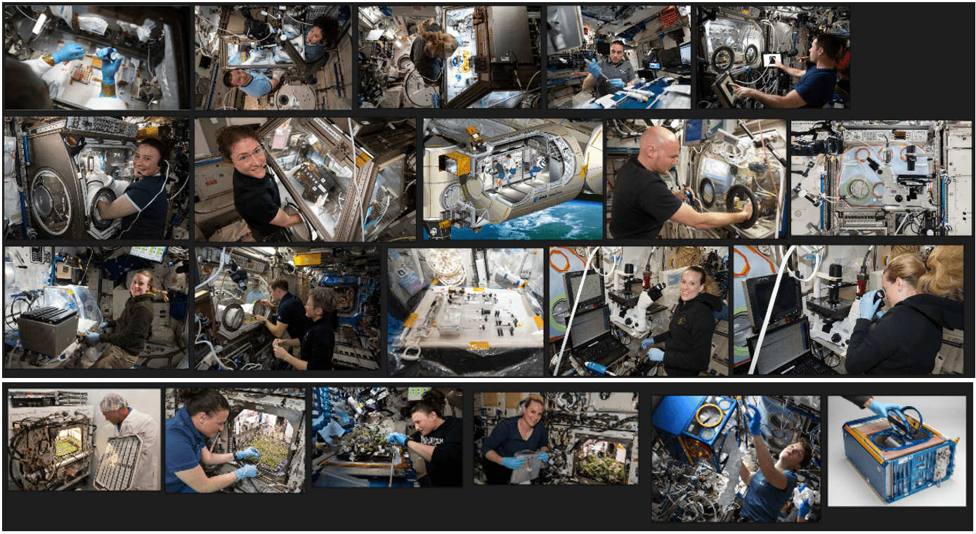
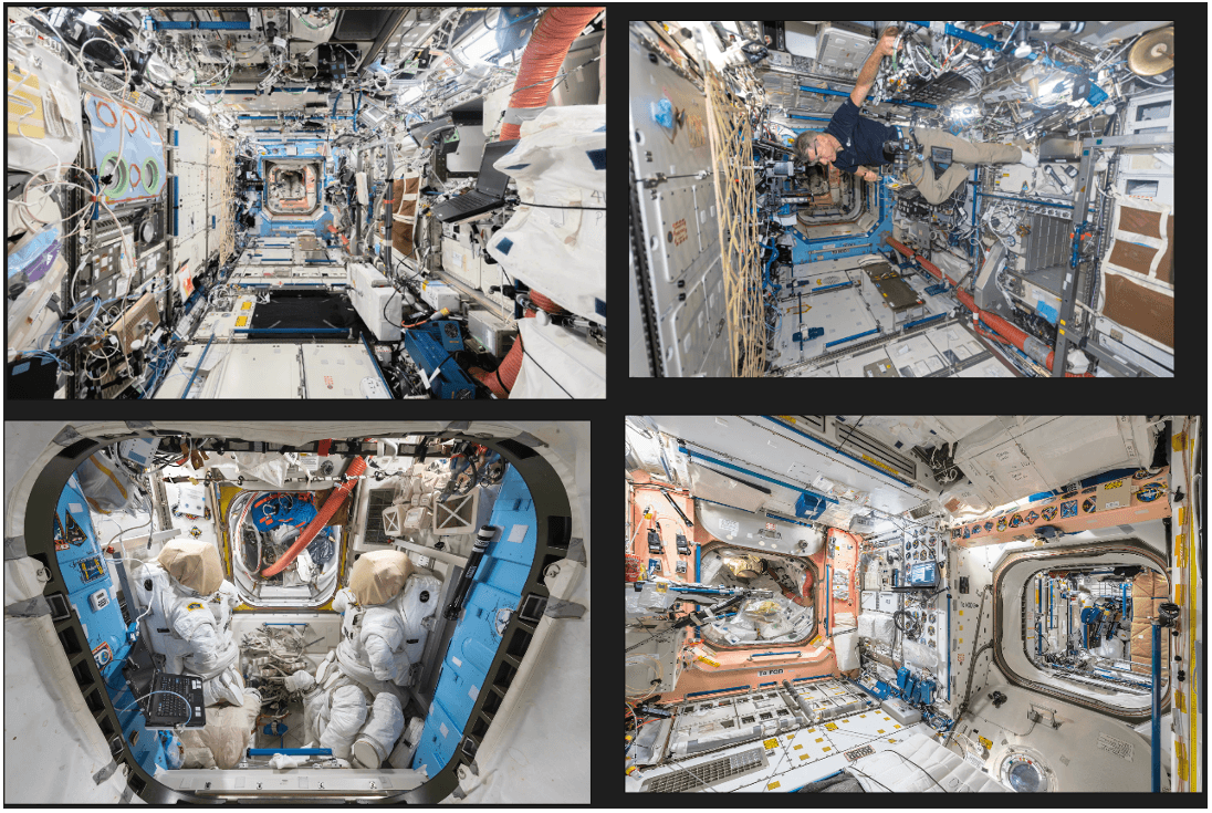
I collected as many visual references as I could find from photographs taken on real space stations, including space labs, cultivated plants, astronauts, and equipment. All of my reference images were gathered in PureRef, a free desktop program intended for storing references on a mood board. Below are the references that I used to design the environment of the sketch:
I researched and sketched the layout concurrently because I found it easier to organize all of the content once I knew the information that I was going to include. Much research about the effects of microgravity has already been published; therefore, I categorized the data into four broad subjects: effects on plants, animals, humans, and bacteria, which I felt provided a sufficient overview of this topic. While researching, I noticed that I would need to condense a large amount of data into minimal text in order to fit spatially on the infographic. I decided that the target audience would be science-oriented, meaning that they would be familiar with scientific terms but not require knowledge of complex jargon specific to different fields.
I produced a rough draft that fleshed out my detailed thumbnail. One of the most challenging aspects of this design was finding a way to ‘de-clutter the clutter’ – I found that my eye jumped all over the page for this sketch and did not follow a particular reading order, which I had originally intended with the use of liquid droplets:
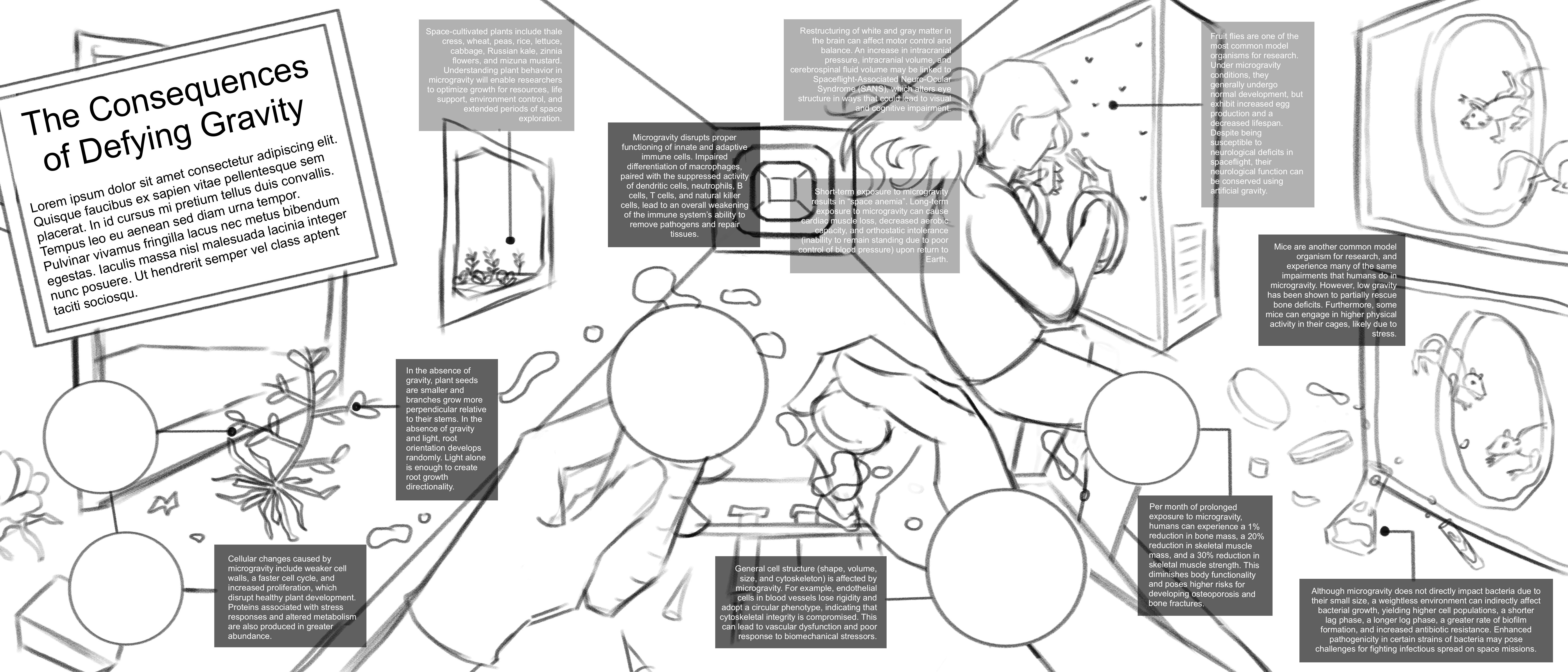
The feedback that I received for this draft helped me refine the hierarchy of elements across the page. When I created the second iteration of my sketch, I emphasized the central area with the hands by leaving the related callouts a dark value (indicating foreground) while the remaining callouts were lighter in value (indicating background). I rearranged elements into inner and outer arcs and condensed the text even more, ending up with 9 callouts instead of my original 11. The resulting draft can be seen below:
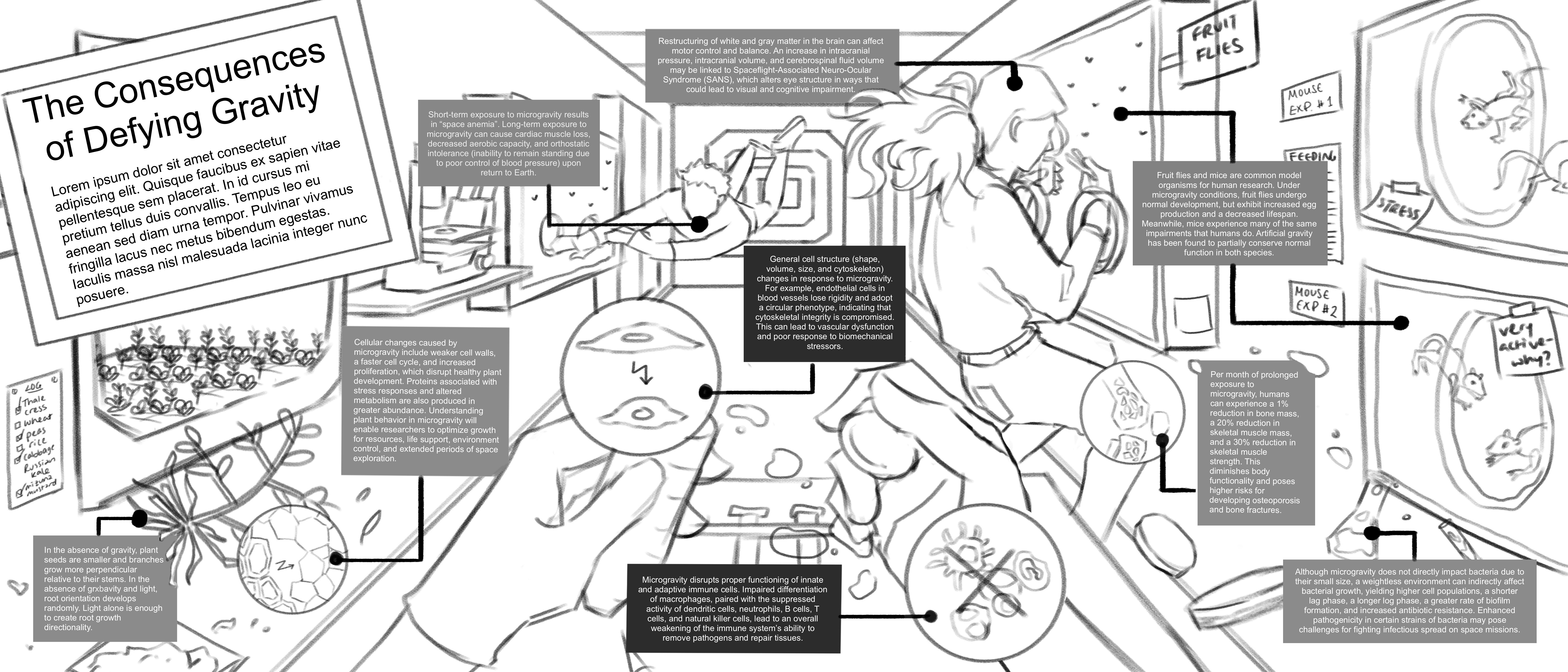
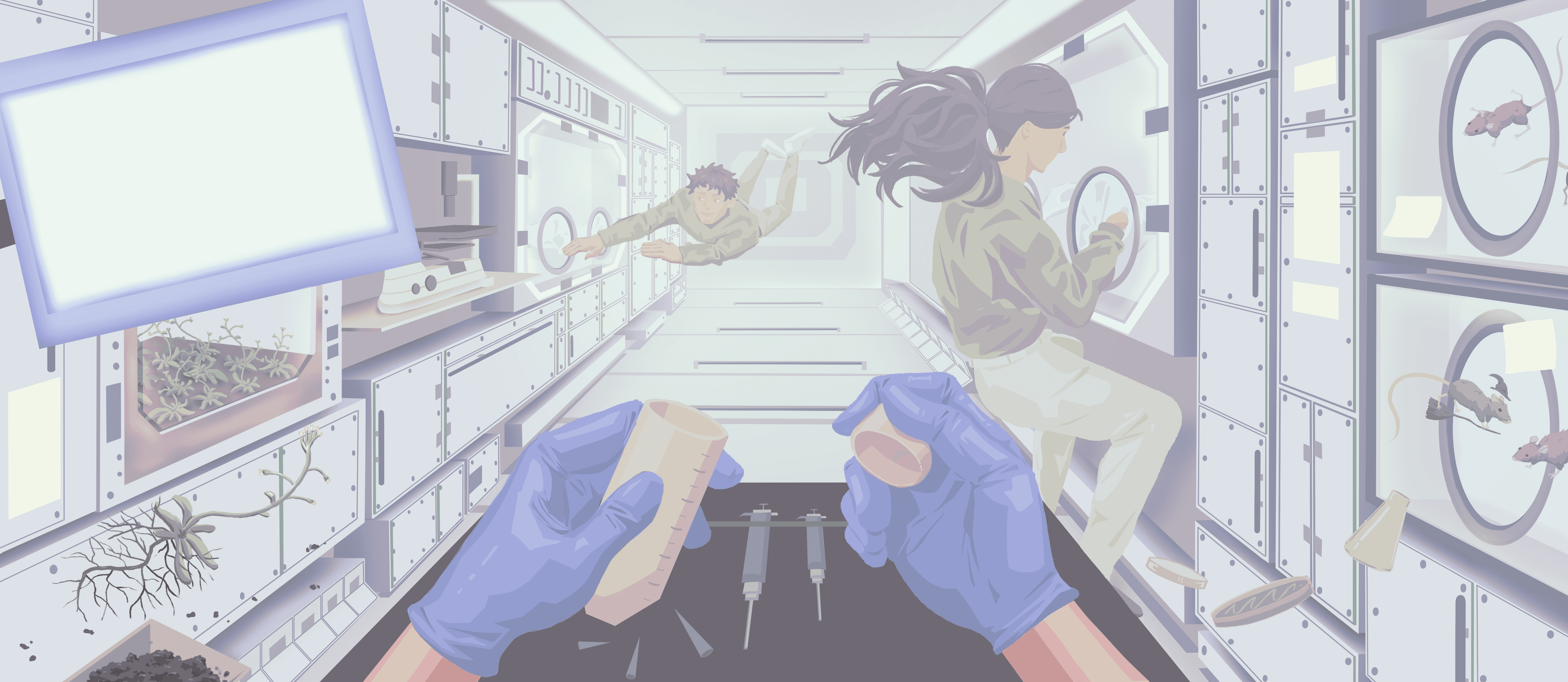
I then blocked in a rough color scheme for the entire piece. I aimed to use a cooler, desaturated palette to indicate a sterile and scientific environment.
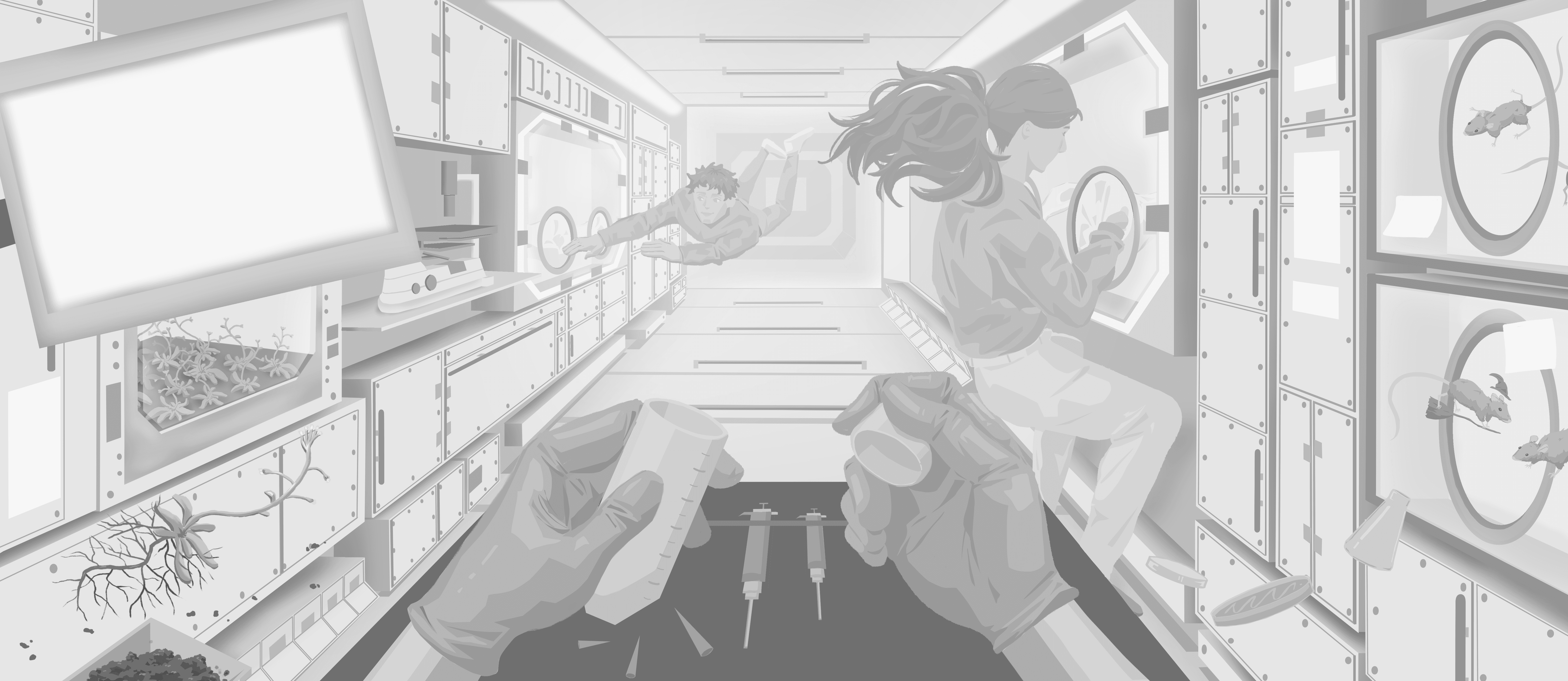
I rendered this piece first in grayscale to establish appropriate relative values before colorizing it afterwards.
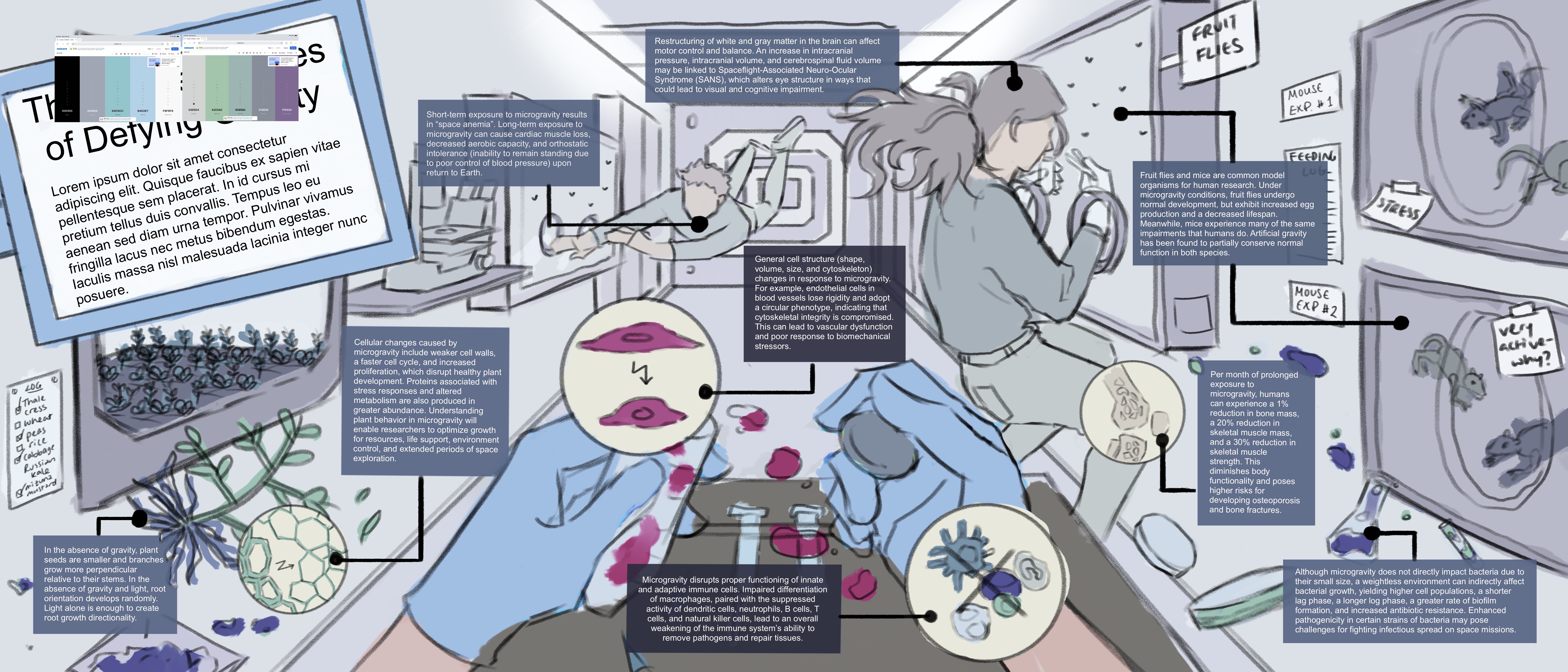
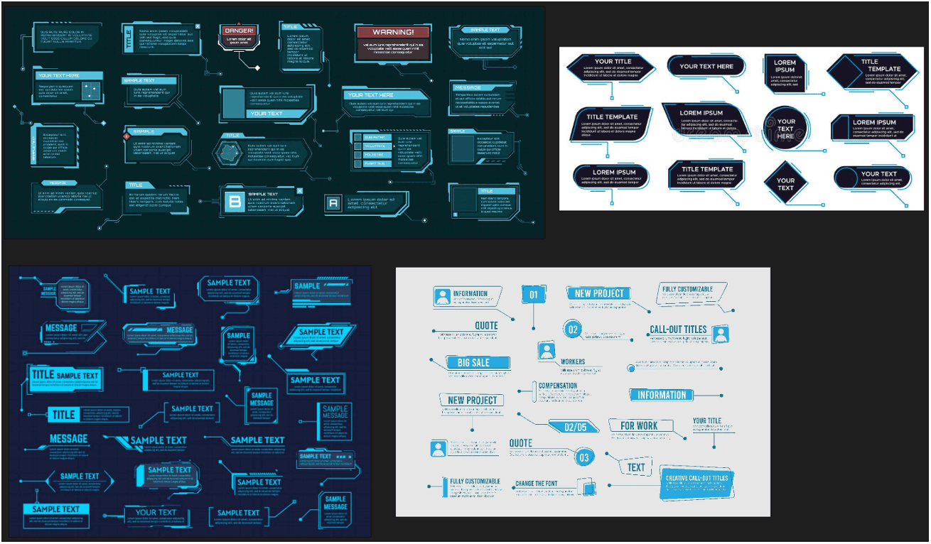
To create the callouts, labels, and text, I imported the image into Adobe Illustrator. I wanted the text callouts to follow a futuristic and digital theme, as often associated with space-related media, similar to the reference images below:
My final touches included adding floating elements. Taken altogether, my final piece can be viewed below:
Media
ArtStudio Pro, Adobe Illustrator
Target Audience
Science-interested general audience
Client
Jodie Jenkinson
Context
For this infographic, I wanted to visualize the different biological, cellular, and physiological responses to microgravity. The purpose of this visualization was to educate the audience on how space affects living organisms on Earth. Fun fact: this project was finalized around the time that both Project Hail Mary was released and the Artemis II launch occurred, which was a lucky coincidence!
Process
I created two conceptual thumbnails for this topic, shown below:
The top one depicted a scene in space where moon- or planet-shaped callouts of different sizes would orbit the Earth, containing 2D illustrations of the effects of microgravity on multiple biological specimens. The bottom one depicted a scene in a laboratory on a space station, with objects floating midair around a scientist conducting research. I decided that the bottom one would produce more visual interest for an infographic and provide more flexibility for the design, so I honed in on this concept to create more detailed thumbnails. At this point, I prioritized layout and did not concern myself with the content of the text callouts. The detailed thumbnails can be seen below.
For my first detailed thumbnail, I started with a long, horizontal spread. My goal was to ensure that the audience would read this infographic from left to right, so I placed the title on the left side of the page and ensured that elements were organized with depth in mind towards the right side of the page. I assumed that including faces in this design would attract the viewers’ attention first, which informed my decision to illustrate the characters as if they were communicating with each other.
For my second detailed thumbnail, I set up a one-point perspective view from the eyes of a scientist in the space station. I arranged several foreground and background elements to reduce the amount of negative space in the scene. I preferred this concept to the first detailed thumbnail because it felt more dynamic and natural. However, I lacked a definitive method to effectively lead the viewer’s eye across the page due to the number of cluttered elements present in the foreground. I thought I could use suspended liquid droplets as a way to introduce a left-to-right viewing flow. Ultimately, after receiving feedback from my professor, I decided to proceed with this concept.
I collected as many visual references as I could find from photographs taken on real space stations, including space labs, cultivated plants, astronauts, and equipment. All of my reference images were gathered in PureRef, a free desktop program intended for storing references on a mood board. Below are the references that I used to design the environment of the sketch:
I researched and sketched the layout concurrently because I found it easier to organize all of the content once I knew the information that I was going to include. Much research about the effects of microgravity has already been published; therefore, I categorized the data into four broad subjects: effects on plants, animals, humans, and bacteria, which I felt provided a sufficient overview of this topic. While researching, I noticed that I would need to condense a large amount of data into minimal text in order to fit spatially on the infographic. I decided that the target audience would be science-oriented, meaning that they would be familiar with scientific terms but not require knowledge of complex jargon specific to different fields.
I produced a rough draft that fleshed out my detailed thumbnail. One of the most challenging aspects of this design was finding a way to ‘de-clutter the clutter’ – I found that my eye jumped all over the page for this sketch and did not follow a particular reading order, which I had originally intended with the use of liquid droplets:
The feedback that I received for this draft helped me refine the hierarchy of elements across the page. When I created the second iteration of my sketch, I emphasized the central area with the hands by leaving the related callouts a dark value (indicating foreground) while the remaining callouts were lighter in value (indicating background). I rearranged elements into inner and outer arcs and condensed the text even more, ending up with 9 callouts instead of my original 11. The resulting draft can be seen below:
I then blocked in a rough color scheme for the entire piece. I aimed to use a cooler, desaturated palette to indicate a sterile and scientific environment.
I rendered this piece first in grayscale to establish appropriate relative values before colorizing it afterwards.
To create the callouts, labels, and text, I imported the image into Adobe Illustrator. I wanted the text callouts to follow a futuristic and digital theme, as often associated with space-related media, similar to the reference images below:
My final touches included adding floating elements. Taken altogether, my final piece can be viewed below: