
Emergency Departments in Canada: Case Study
Emergency Departments in Canada: Case Study
Media
Adobe Illustrator, Tableau, RawGraphs
Target Audience
General Canadian audience
Client
Jodie Jenkinson
Context
For this project, I wanted to visualize quantitative data associated with emergency department (ED) wait times across different Canadian provinces and territories. The purpose of this visualization was to shed light on the current landscape of our public healthcare system by explaining the role of contributing factors to ED wait times, which are associated with areas of improvement still required from the government.
Process
From conceptualization, I wanted the composition of this piece to be shaped around the spatial layout of an ED. I first began with a clear thumbnail depicting a maze of potential hospital rooms and corridors that would house graphs of data, keeping in mind that chairs and beds would need to be incorporated into each room to signify wait times.

To determine the amount of rooms needed in this layout, I needed to understand how much information to include in the piece. I researched and compiled as much publicly available information as possible before distilling common variables and points of interest down to six key categories. The data sources used in this project are listed below:
Variable | Reference |
|---|---|
Number of ED visits by age group and median length of stay, from 2018-2019 to 2021-2022 | |
Number of ED physicians per 1000 population, from 2018-2021 | CADTH: Emergency Department Overcrowding Utilization Analysis |
Change in number of ED visits, time to initial assessment, and hospital bed wait times pre-pandemic to post-pandemic, from 2019-2021 | |
Proportion of patients leaving ED untreated in 2024 | IEDM: Too Many Canadians Are Leaving Emergency Rooms Untreated |
Time to initial assessment by ED physician in 2024-2025 | CIHI: Emergency Department Wait Time for Physician Initial Assessment |
Length of stay on stretchers, time to assessment (general population vs patients on stretchers), and number of patients on stretchers in the ED >24 and >48 hours in Quebec, from 2022-2026 |
I focused on gathering data from these specific years because they were consistent with each other, allowing for easy coordination between different types of graphs. Examples of variables that I excluded, either because they were irrelevant to the topic, repetitive, or lacking information for different regions or years, are listed below:
Facility
Total beds available in the hospital
Percentage of ED visits by older adults or acuity
Number of patient deaths in ED
90th percentile data
Stratification by rural/remote vs urban locations
Wait time displays
To clean the data, I used Tableau Prep to remove unnecessary fields, collect similar data, and find common variables between different data sets. I experimented with different methods of representing data using RawGraphs.io, Tableau Desktop, and DataVizProject.com. Ultimately, I settled on the following representations of data:
Beeswarm plot (via RawGraphs.io) to show the median length of stay in the ED over four years
Stacked bar charts (via Tableau) to demonstrate the number of ED visits over four years
Choropleth map (via Tableau) to depict time to physician initial assessment in 2024
Bar charts (via Tableau) to call out various data sets from Quebec over four years
Dual-axis line graph (via Tableau) to show the impact of the COVID-19 pandemic on different variables in the ED
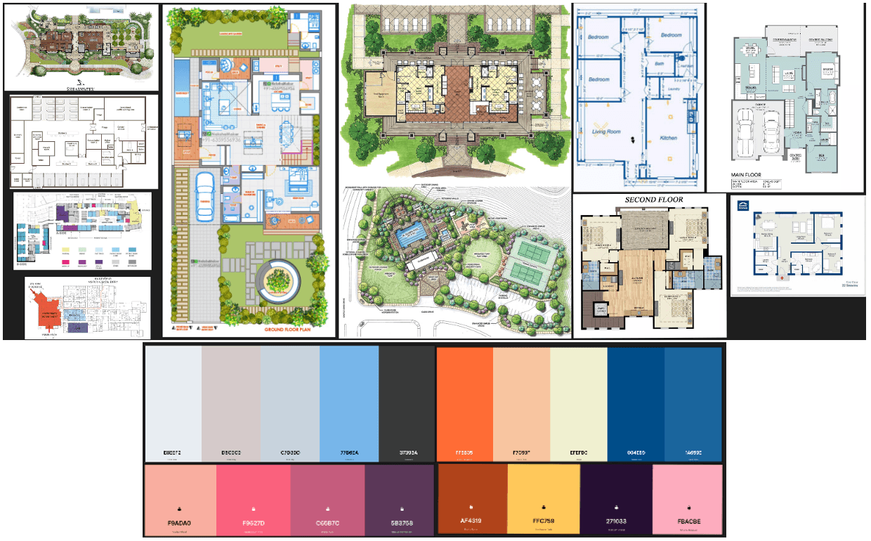
I wanted the main figure for this piece to be related to the passage of time. Due to the shape of the beeswarm plot, I theorized that the outline of an hourglass could be added around the data to match the metaphor. Furthermore, to determine the composition of ED rooms, I referred to the following visual references and potential colour palettes (generated by Coolors.io):
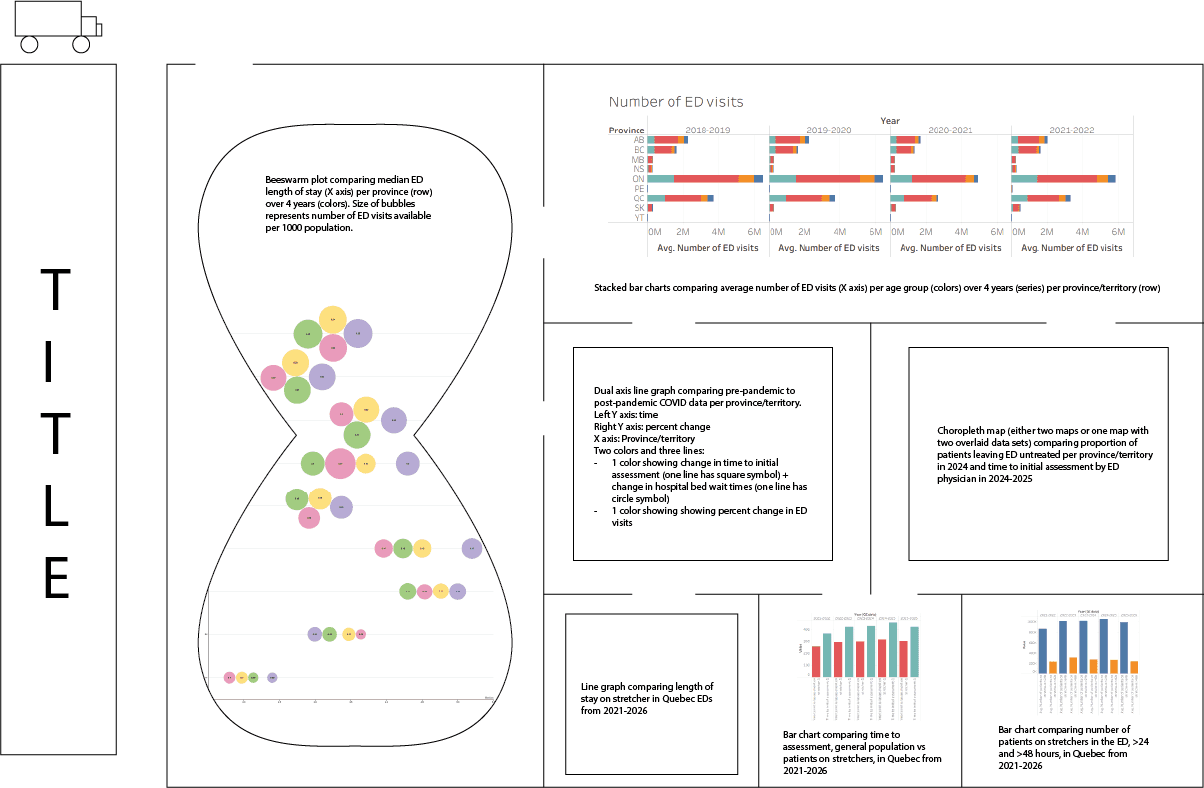
I was then able to create a rough draft of the layout, shown below:
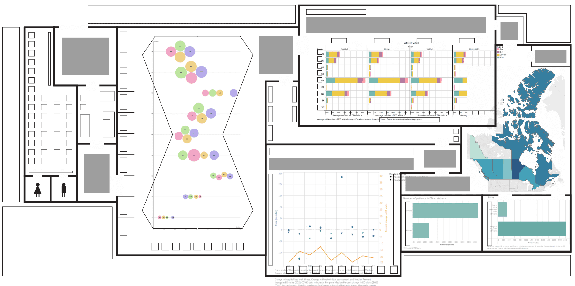
The final layout was fleshed out from this draft, ensuring that the viewer's eye would be able to be led through the rooms using open doorways. Another key element that I wanted to include was chairs, beds, and tables to define axis labels and create a cohesive, thematic relationship between the graphs and the spatial layout.
Cool colours dominated the majority of the hospital layout to convey a sense of clinical sterility, while warm colours made up the majority of figures to increase visual salience and draw attention to the most important elements of the piece. I created visual diversity in the layout of the ED by varying the sizes of the rooms as well as the colours of the waiting rooms and grass outdoors.
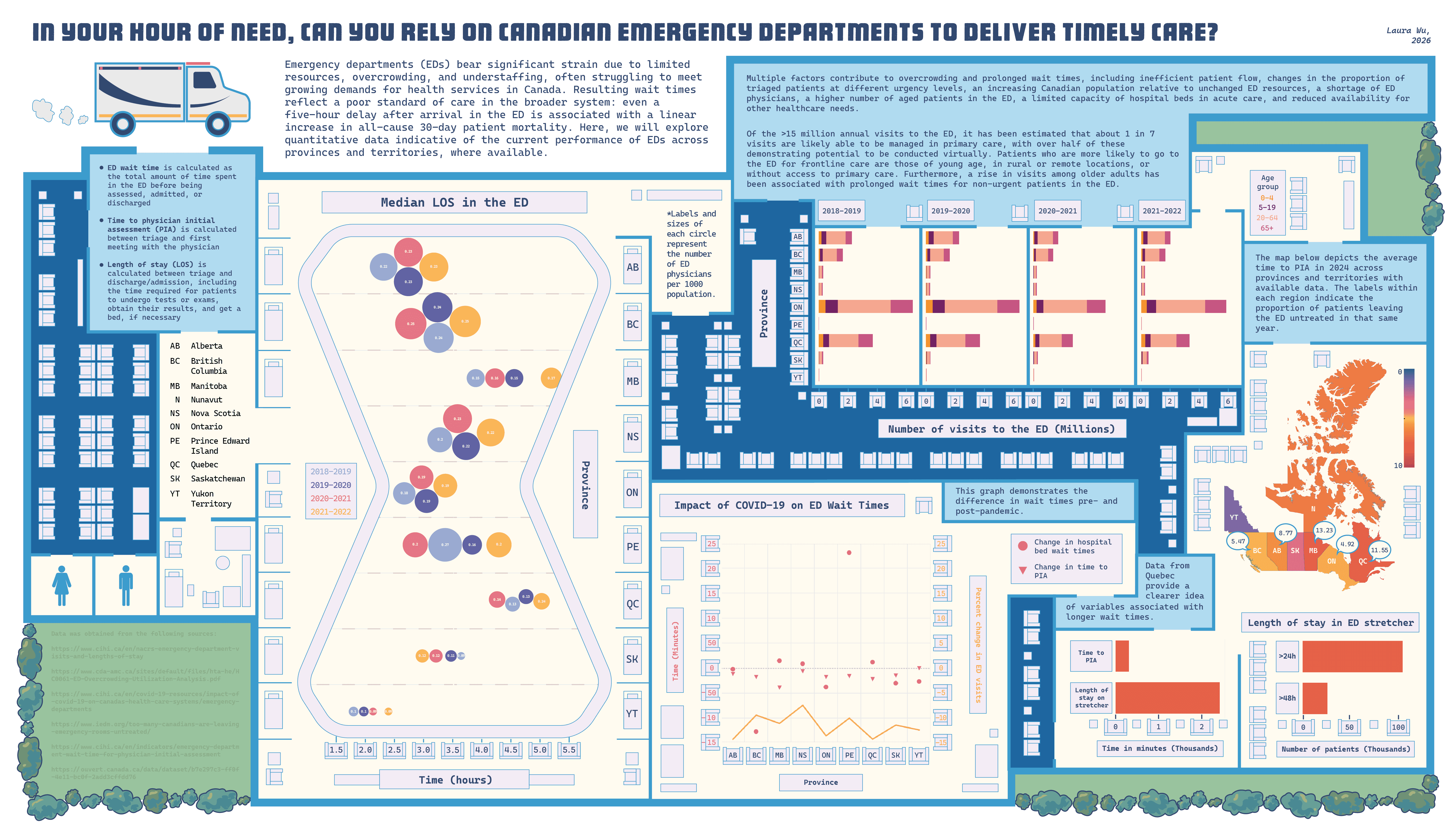
Altogether, my final piece can be shown below:
Media
Adobe Illustrator, Tableau, RawGraphs
Target Audience
General Canadian audience
Client
Jodie Jenkinson
Context
For this project, I wanted to visualize quantitative data associated with emergency department (ED) wait times across different Canadian provinces and territories. The purpose of this visualization was to shed light on the current landscape of our public healthcare system by explaining the role of contributing factors to ED wait times, which are associated with areas of improvement still required from the government.
Process
From conceptualization, I wanted the composition of this piece to be shaped around the spatial layout of an ED. I first began with a clear thumbnail depicting a maze of potential hospital rooms and corridors that would house graphs of data, keeping in mind that chairs and beds would need to be incorporated into each room to signify wait times.
To determine the amount of rooms needed in this layout, I needed to understand how much information to include in the piece. I researched and compiled as much publicly available information as possible before distilling common variables and points of interest down to six key categories. The data sources used in this project are listed below:
Variable | Reference |
|---|---|
Number of ED visits by age group and median length of stay, from 2018-2019 to 2021-2022 | |
Number of ED physicians per 1000 population, from 2018-2021 | CADTH: Emergency Department Overcrowding Utilization Analysis |
Change in number of ED visits, time to initial assessment, and hospital bed wait times pre-pandemic to post-pandemic, from 2019-2021 | |
Proportion of patients leaving ED untreated in 2024 | IEDM: Too Many Canadians Are Leaving Emergency Rooms Untreated |
Time to initial assessment by ED physician in 2024-2025 | CIHI: Emergency Department Wait Time for Physician Initial Assessment |
Length of stay on stretchers, time to assessment (general population vs patients on stretchers), and number of patients on stretchers in the ED >24 and >48 hours in Quebec, from 2022-2026 |
I focused on gathering data from these specific years because they were consistent with each other, allowing for easy coordination between different types of graphs. Examples of variables that I excluded, either because they were irrelevant to the topic, repetitive, or lacking information for different regions or years, are listed below:
Facility
Total beds available in the hospital
Percentage of ED visits by older adults or acuity
Number of patient deaths in ED
90th percentile data
Stratification by rural/remote vs urban locations
Wait time displays
To clean the data, I used Tableau Prep to remove unnecessary fields, collect similar data, and find common variables between different data sets. I experimented with different methods of representing data using RawGraphs.io, Tableau Desktop, and DataVizProject.com. Ultimately, I settled on the following representations of data:
Beeswarm plot (via RawGraphs.io) to show the median length of stay in the ED over four years
Stacked bar charts (via Tableau) to demonstrate the number of ED visits over four years
Choropleth map (via Tableau) to depict time to physician initial assessment in 2024
Bar charts (via Tableau) to call out various data sets from Quebec over four years
Dual-axis line graph (via Tableau) to show the impact of the COVID-19 pandemic on different variables in the ED
I wanted the main figure for this piece to be related to the passage of time. Due to the shape of the beeswarm plot, I theorized that the outline of an hourglass could be added around the data to match the metaphor. Furthermore, to determine the composition of ED rooms, I referred to the following visual references and potential colour palettes (generated by Coolors.io):
I was then able to create a rough draft of the layout, shown below:
The final layout was fleshed out from this draft, ensuring that the viewer's eye would be able to be led through the rooms using open doorways. Another key element that I wanted to include was chairs, beds, and tables to define axis labels and create a cohesive, thematic relationship between the graphs and the spatial layout.
Cool colours dominated the majority of the hospital layout to convey a sense of clinical sterility, while warm colours made up the majority of figures to increase visual salience and draw attention to the most important elements of the piece. I created visual diversity in the layout of the ED by varying the sizes of the rooms as well as the colours of the waiting rooms and grass outdoors.
Altogether, my final piece can be shown below: